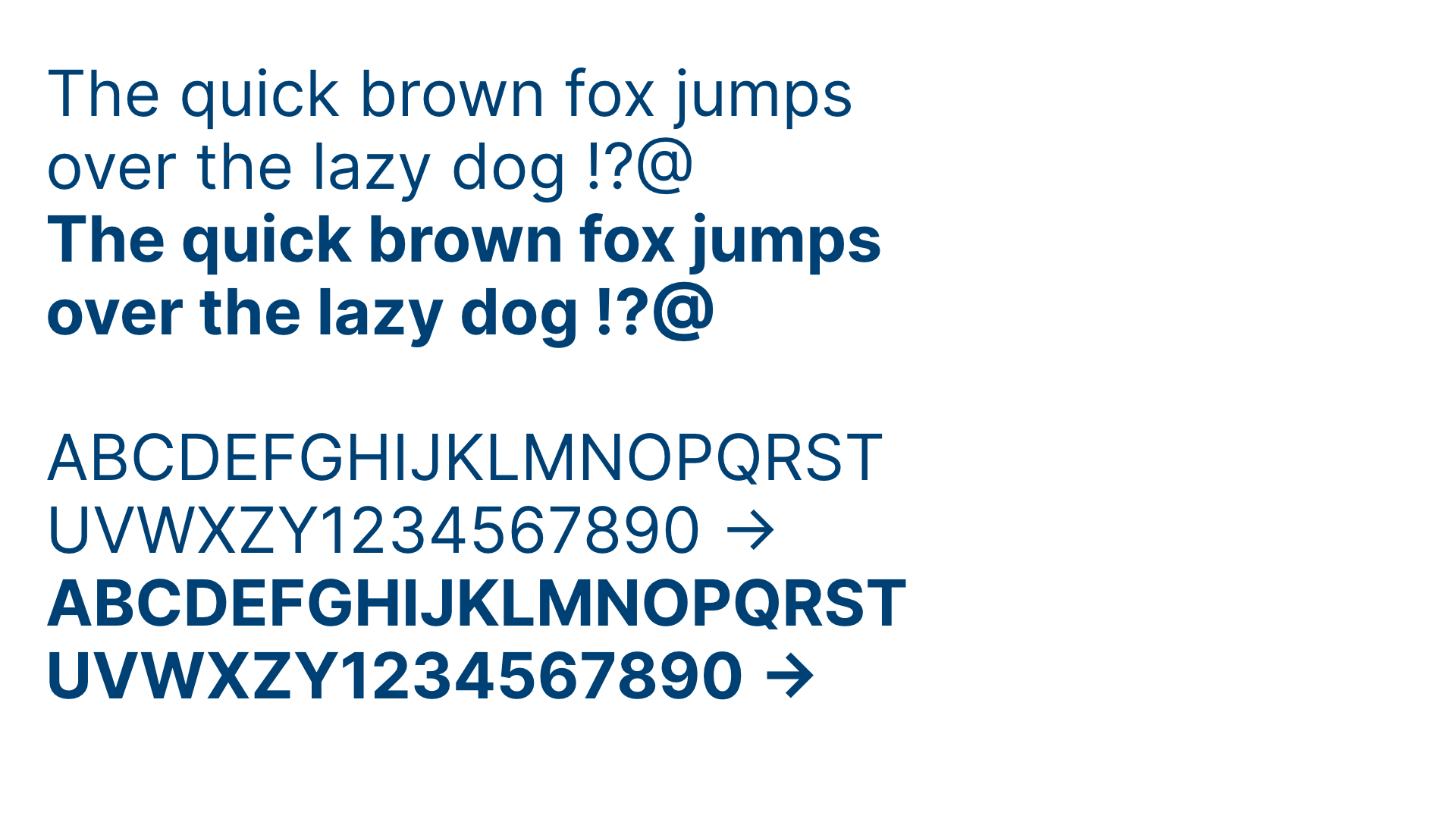
Inter, our no-nonsense typeface, provides clarity and the opportunity to creating good, consistent, and well-strucured typography. It is used in all print and digital applications. It is a geometric neo-grotesque typeface designed for computer screens and features a tall x-height to aid in readability of mixed-case and lower-case text.
Flush left + alignment
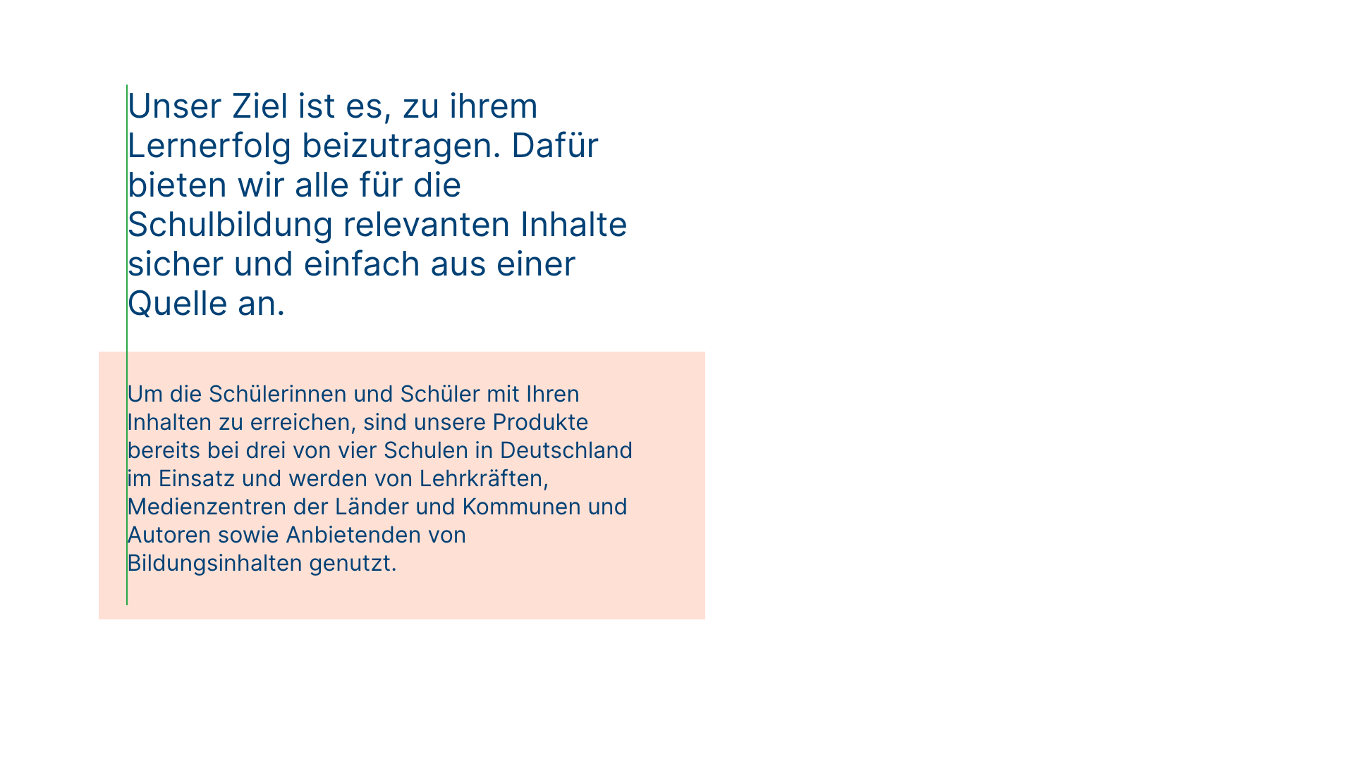
Flush left creates strong alignments for the eye to follow, aiding readability and organization. It is our standard for all typography. Whenever possible, left-align copy with other copy, even when it’s in a container element. This creates a strong vertical alignment with the text, adding clarity for a user.
Case
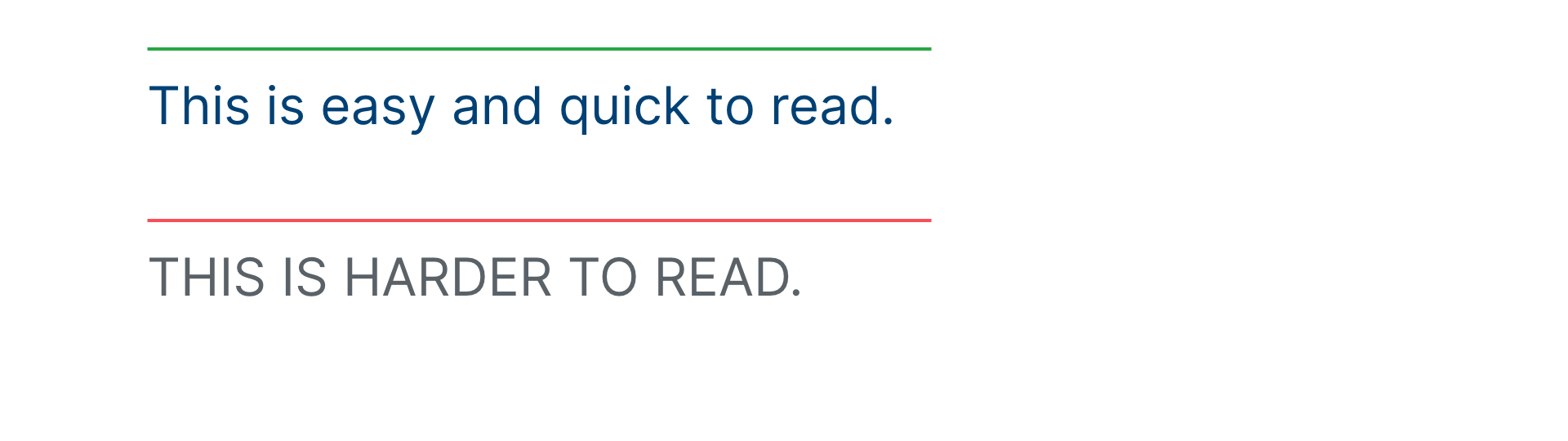
We write content in sentence case. We avoid the use of all uppercase or “all caps”, especially for paragraphs or text.
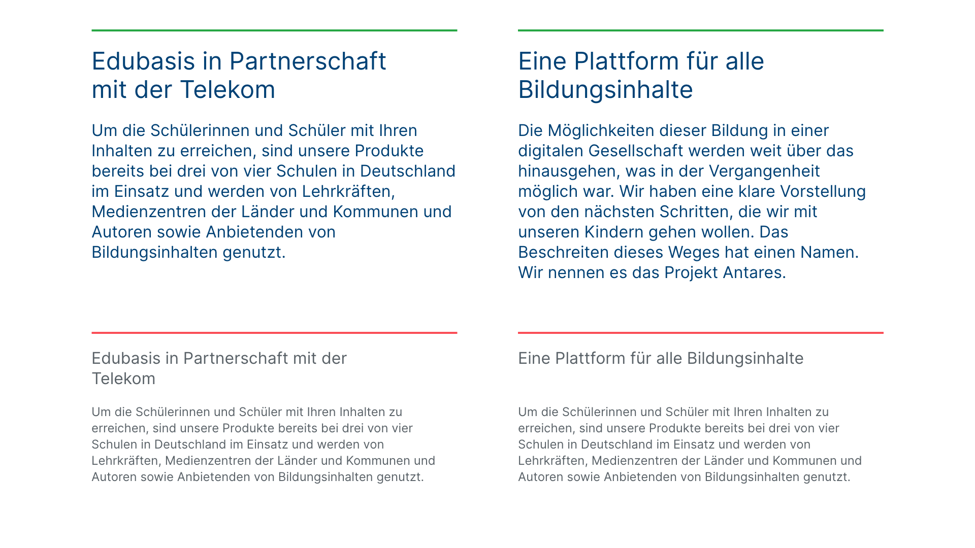
Stacked headlines
Stack headlines into two or even three lines versus keeping them in one long line. This helps create a compact reading unit for the headline, and help avoid widows.
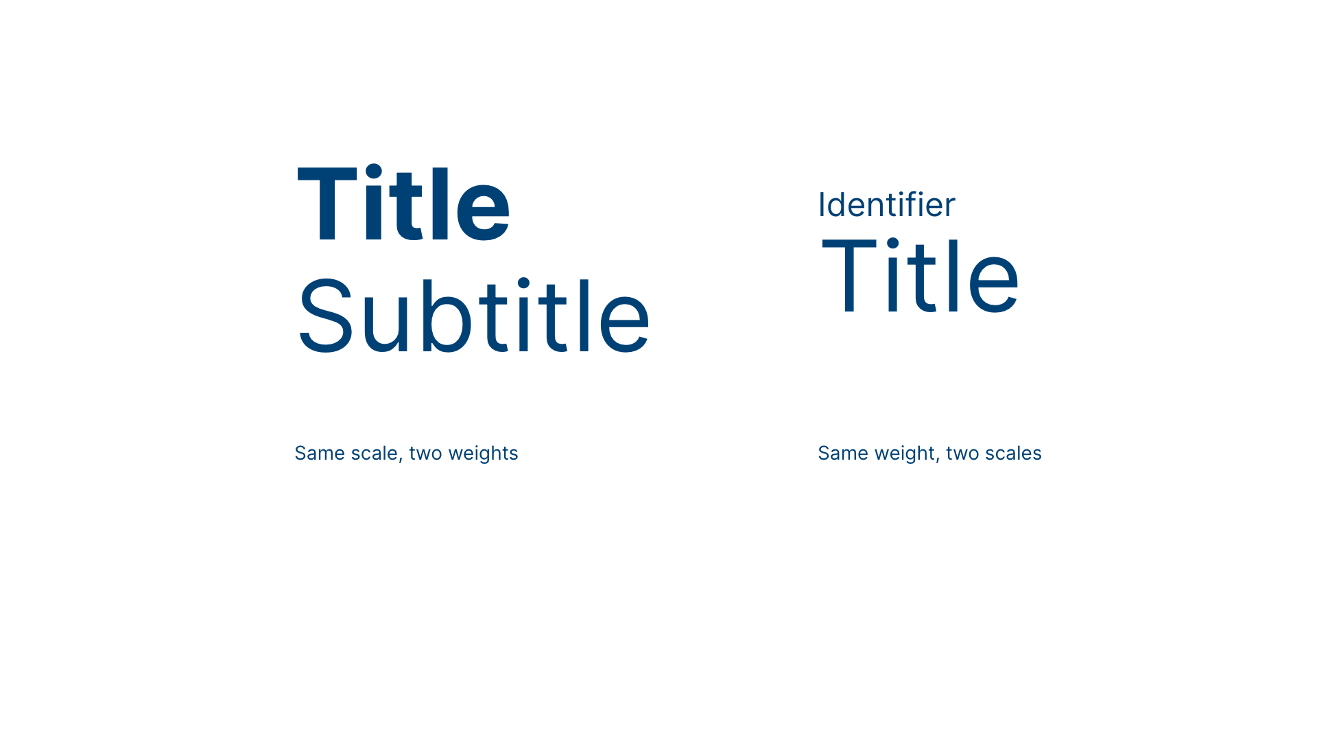
Titles + subtitles
Differentiate titles and subtitles by weight or scale change. Keep it simple (and keep titles short!).
Scale in UI
Our type scale is based on 1em = 16px. We use just enough steps to be able to express hierarchies and structuring information.
| 0.875 | Inter 14 |
|
| 1 | Inter 16 |
Inter 16 |
| 1.25 | Inter 20 | Inter 20 |
| 1.5 | Inter 24 | Inter 24 |
| 2 | Inter 32 | Inter 32 |
| 2.5 | Inter 40 | Inter 40 |
| 3.5 | Inter 56 | Inter 56 |
| 4 | Inter 64 | Inter 64 |
| 4.5 | Inter 72 | Inter 72 |
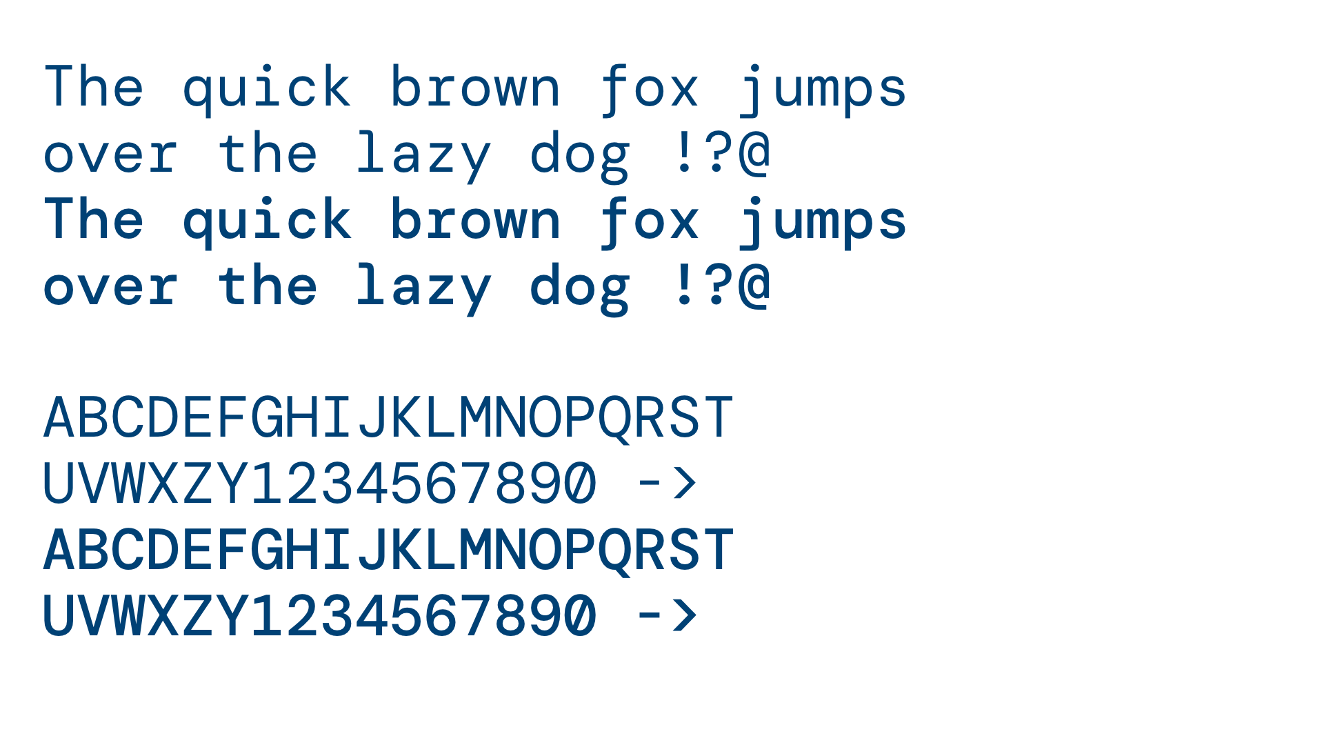
Complementary typeface
DM Mono is a Monospaced font that we use for special highlights such as block quotes, pull quotes, captions, and in illustrations. DM Mono should be used sparingly and always together with Inter.