Below are some special design guidelines for our flagship product Edupool. While aligning with the Antares design system, these guidelines allow Edupool to stand alone as a strong and mature brand with a recognisable identity.
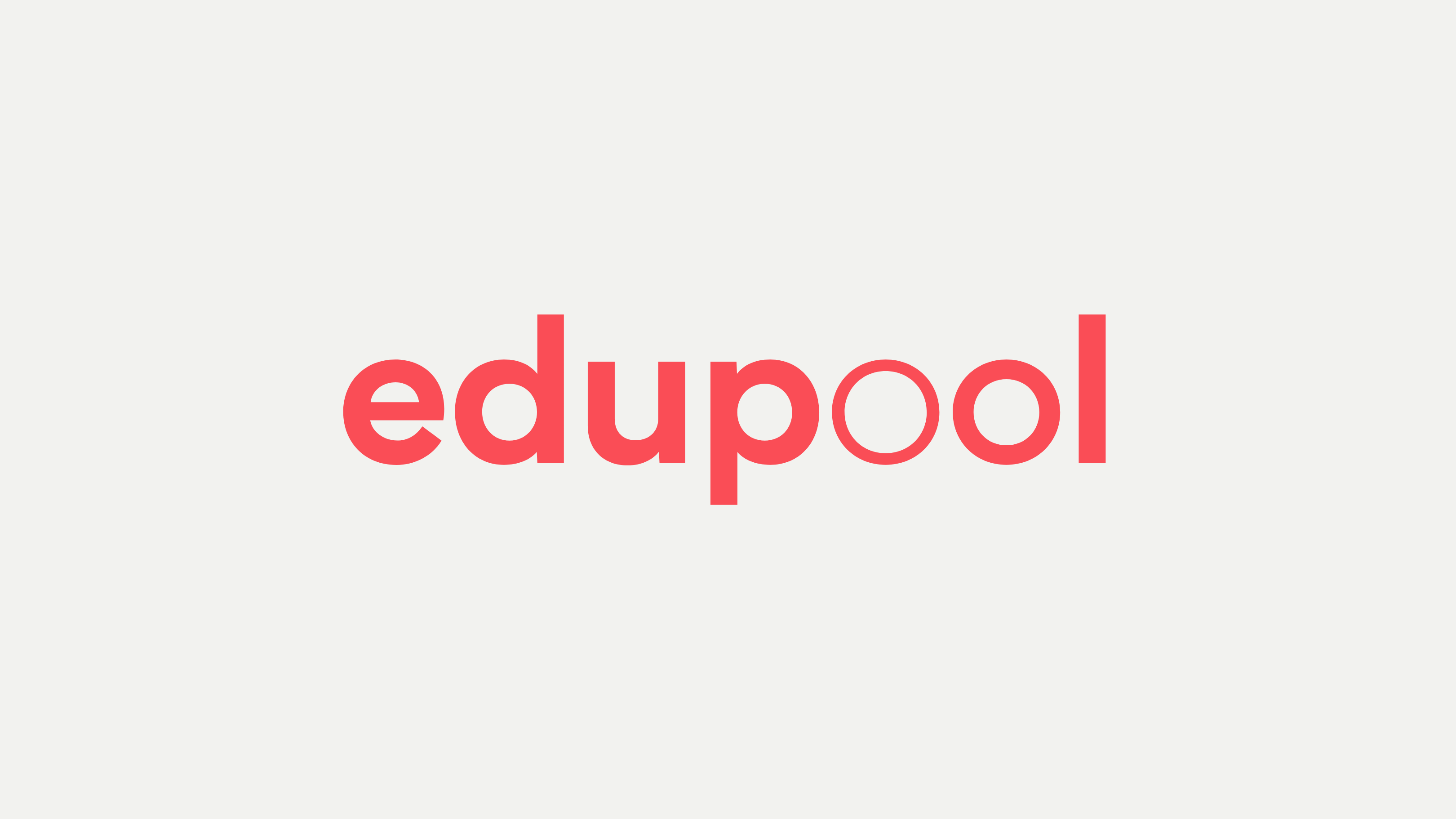
Logotype / Wordmark
The Edupool wordmark is set in Mundial, using three different weights to create the dynamic double-o graphic element.
Typography
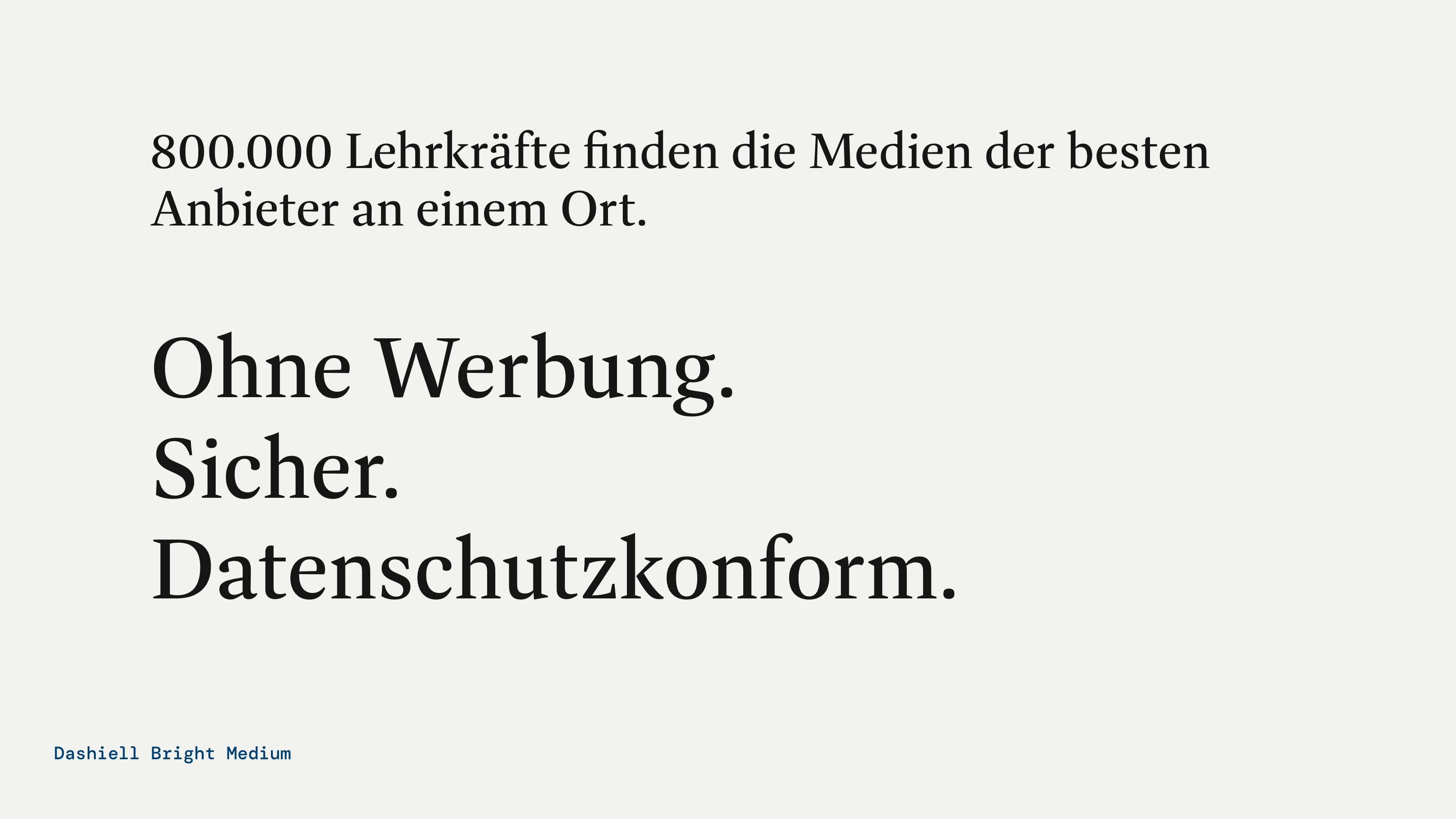
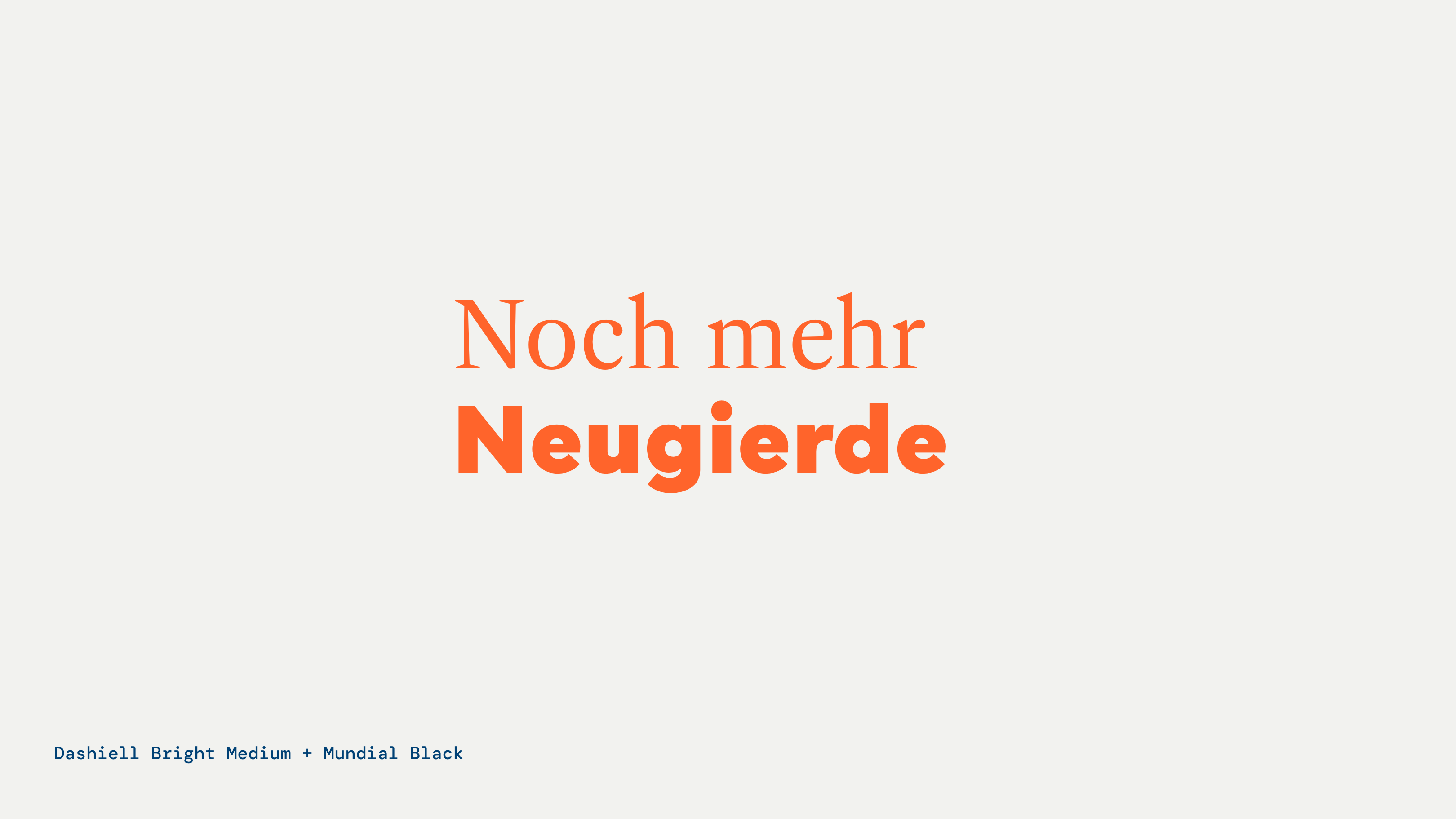
The Edupool identity is extended typographically by the addition of Dashiell Bright (Medium) as a headline font. In special applications, e.g. promotional Marketplace visuals, there's also a combination of Mundial and Dashiell Bright to echo the dual typefaces in the product lock-up.
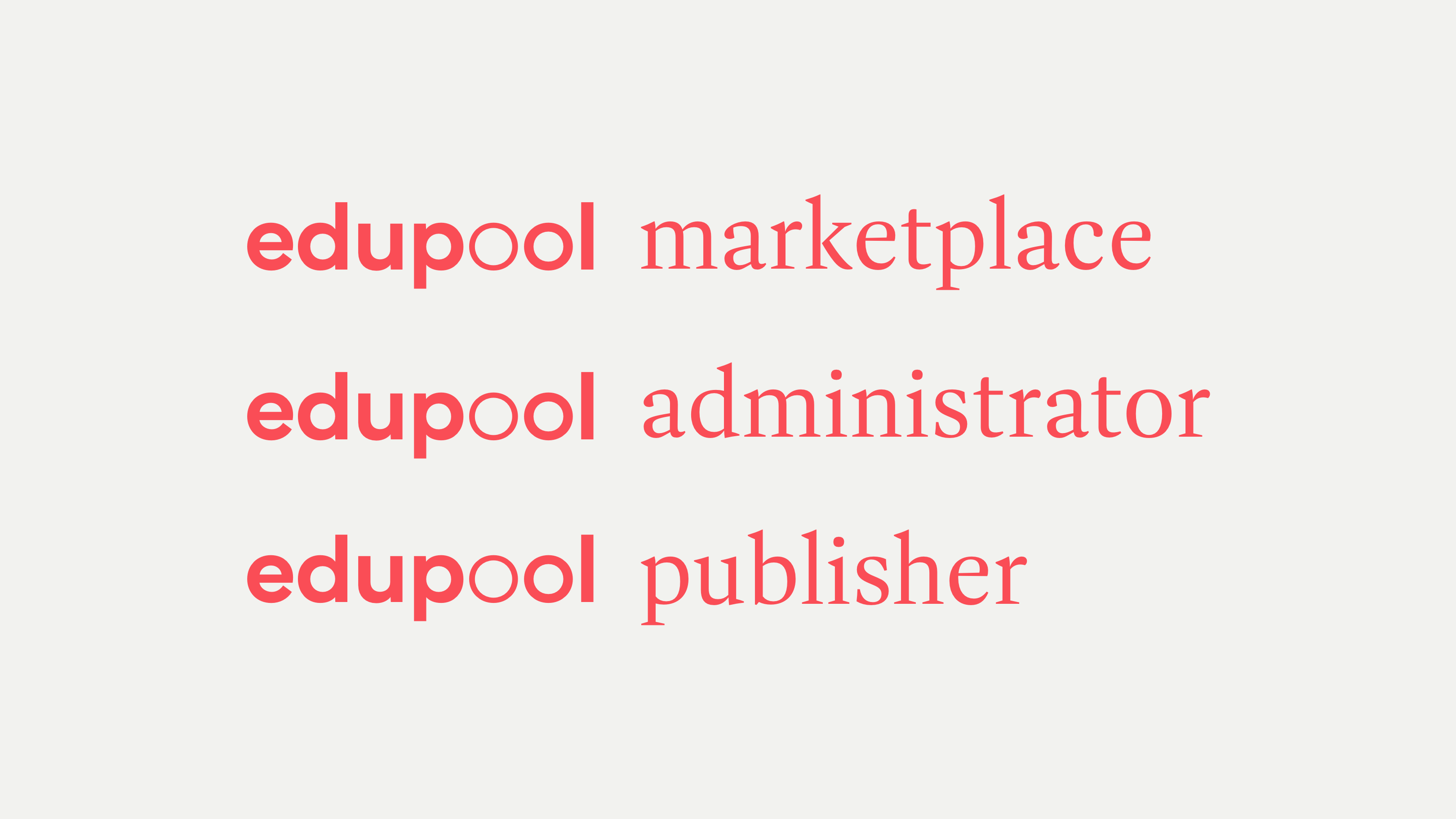
Product lock-ups
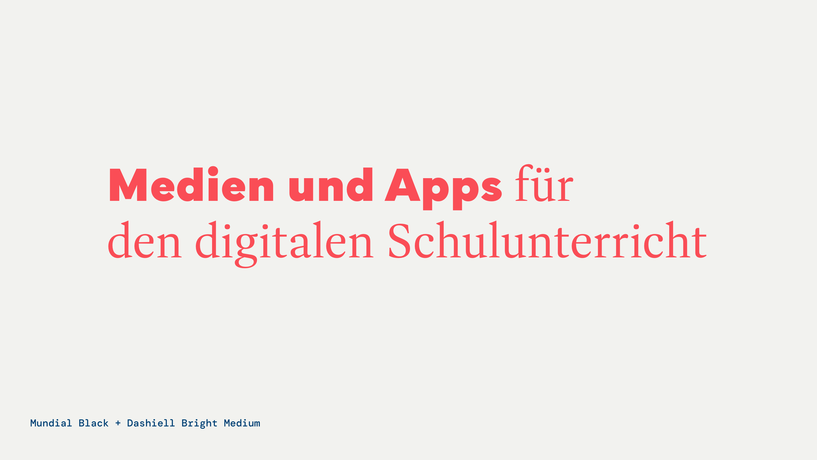
Edupool product names are set in Dashiell Bright combined with the Edupool logotype.
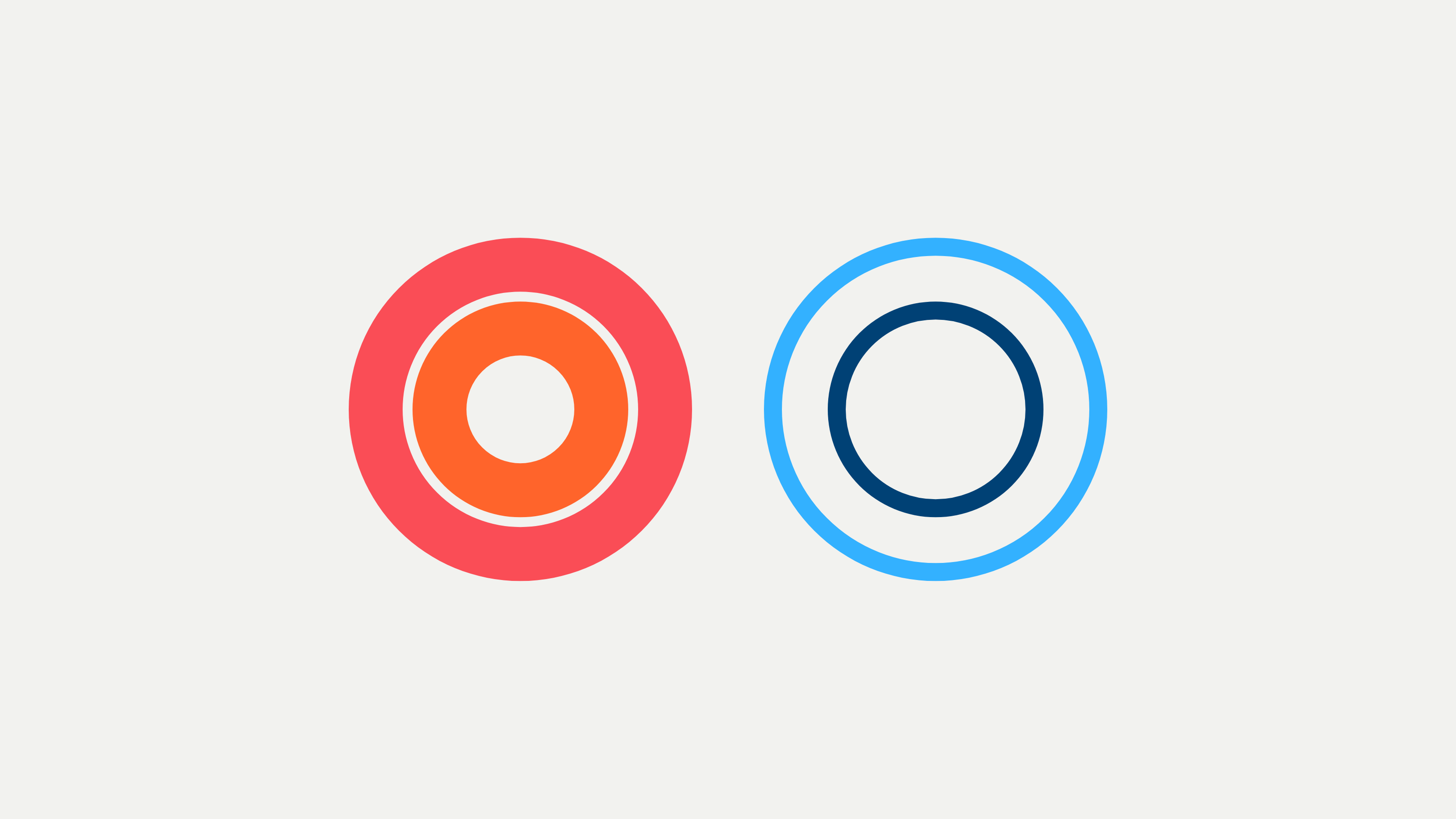
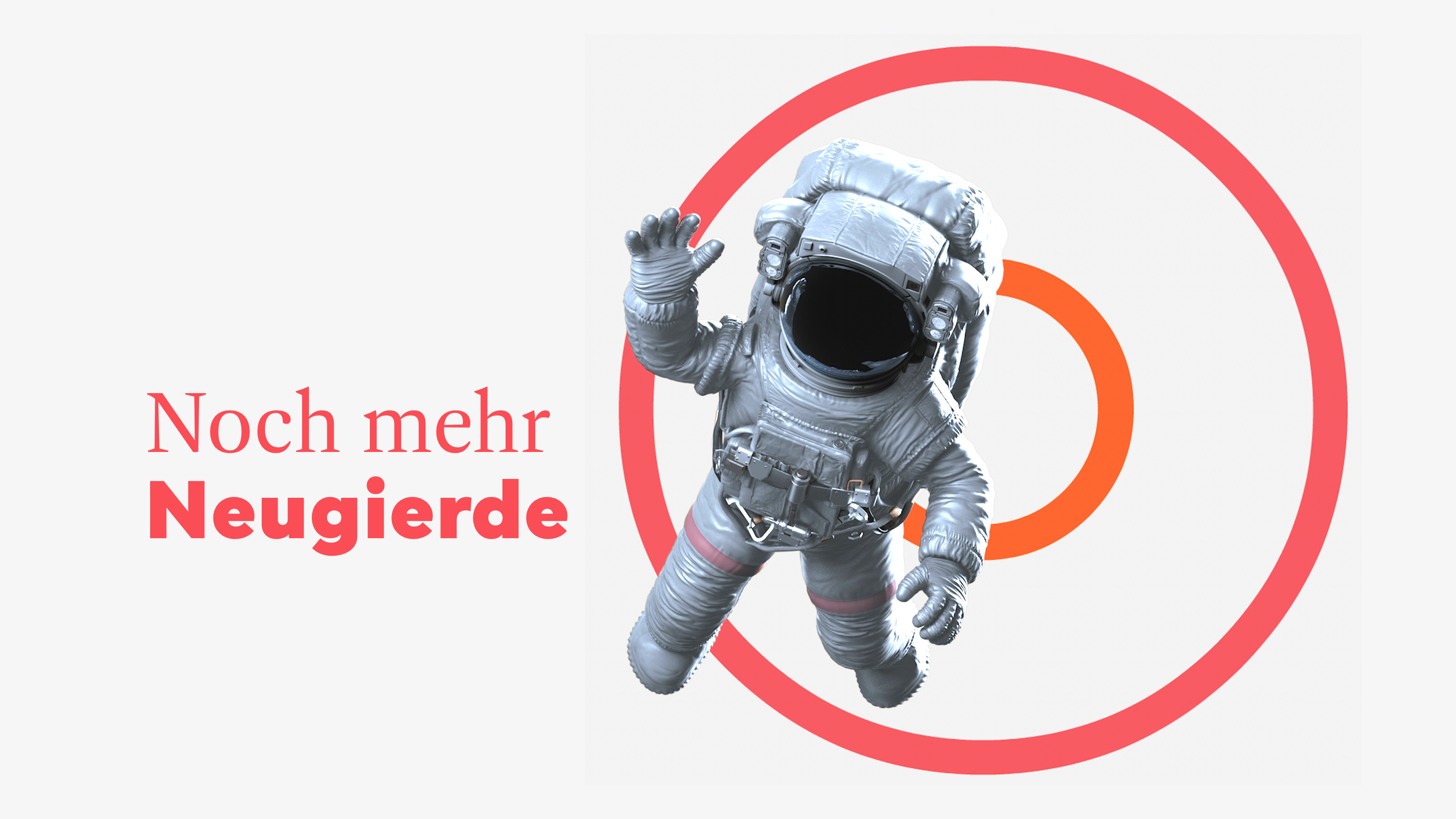
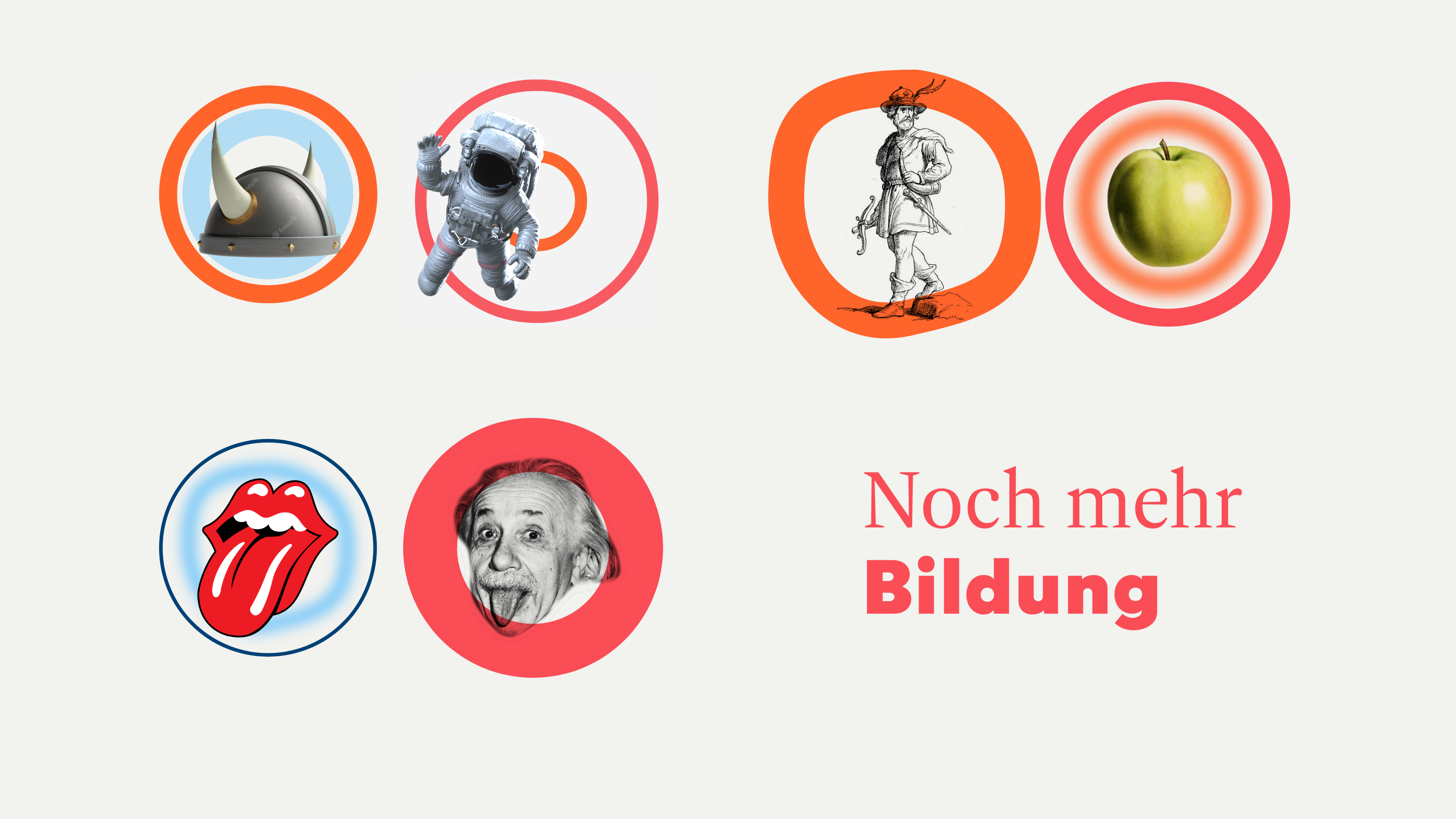
Supergraphic
The concept of two different-weight circular "o" glyphs in the wordmark is extended as a flexible graphic Leitmotif to be used across applications.
They add a certain level of freedom and playfulness to layouts. Note: Use sparingly and effectively.
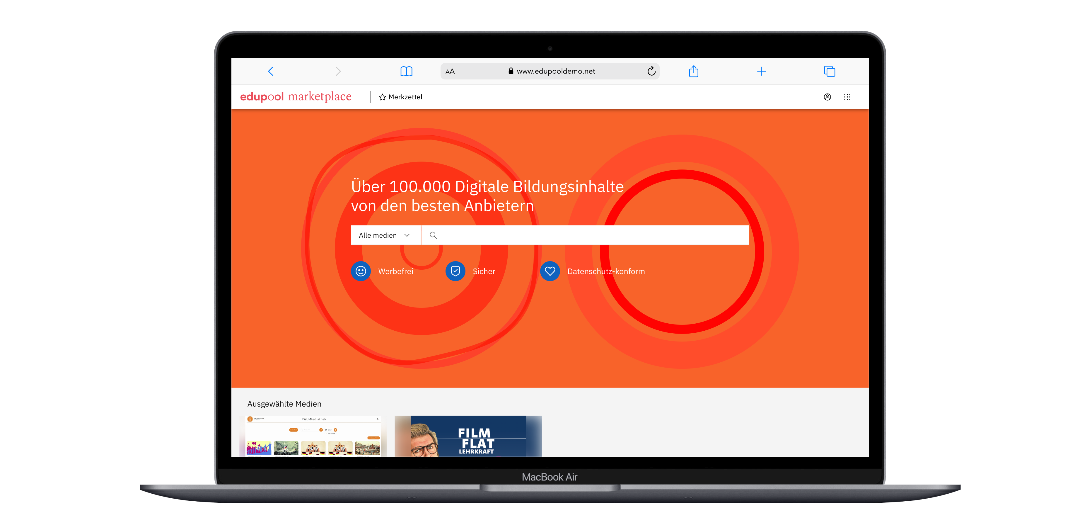
Colour
For all Edupool applications, we use our red colour as key identifier, together with the orange as a secondary colour. The dark and cyan blue are used more sparingly.
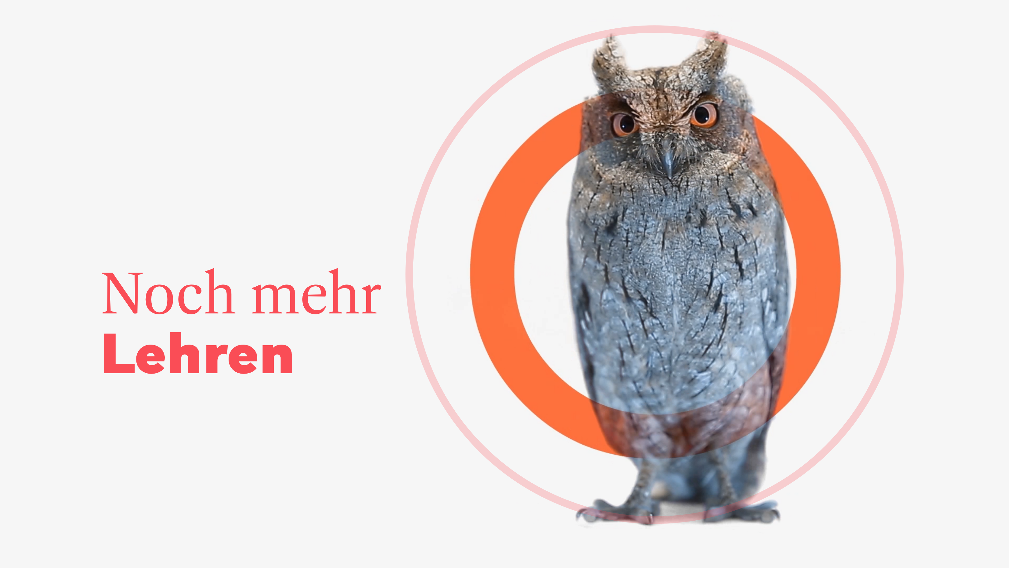
Imagery
The tonality of stock images (scenarios/settings) stay true to the Antares photography guidelines.

However, we use isolated objects when combining images with the Edupool supergraphic to create branded visual assets. These images can be somewhat stylised and artificial as the objects are seperated from context. As such, they are a variation on the collage "hero" images created for Antares (see here).
Resources
Edupool logotype
Edupool product suite logotypes
Edupool Marketplace brand videos (March 2023)
Typefaces
The Dashiell Bright and Mundial fonts can be activated in your Adobe CC application via Adobe fonts.
We own a web-licence for Dashiell Bright Medium (Roman only) .

Illustrations
Temporary repo for illustrations here in Sharepoint